
Adding wind power generating capacity is one occasion when ‘more’, truly means ‘less’. No matter how much of other people’s money gets spent spearing wind turbines all over the countryside, the result is the same: whether it’s 10,000 or 100,000 MW of available wind power capacity, when calm weather sets in, the combined output adds up to nothing.
Like pushing on string, eventually there is absolutely no return on the effort expended.
The simplest way to demonstrate why no economy has ever powered itself using wind power (and why no economy ever will) is to run the numbers. Paul Homewood does just that, with the aid of a new website that collects the pathetic performance of wind farms across Europe and the UK.
New Website For Wind Farm Data
Not a lot of people know that
Paul Homewood
17 May 2020
Someone tipped me off about this website, which has a lot of useful data about renewable energy, both in the UK and Europe:

https://energynumbers.info/uk-offshore-wind-capacity-factors
It is worthwhile playing around with it, but one useful feature is a table of output, capacity factors etc for each offshore installation in the UK. Currently the rolling 12-month average capacity loading is 40.6%.
What I found particularly useful is this chart:
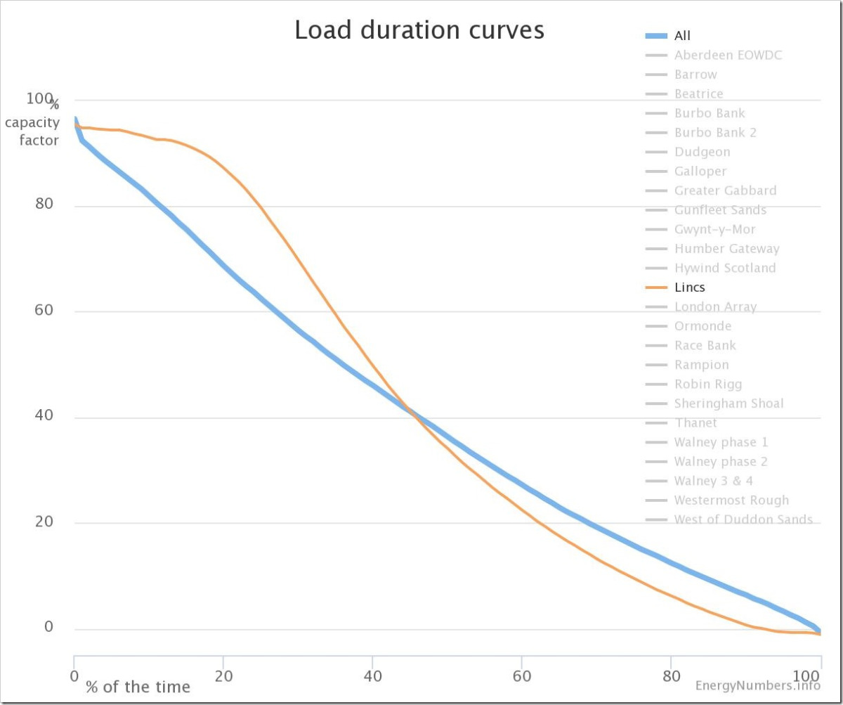
It shows the time distribution of capacity loads, both for individual wind farms and overall.
So for instance, the load factor was 36.3% or more for 50% of the time, ie the median. (This arguably is a more important measure than the average load).
The curve for all windfarms is for the last five years.
If we look at extremes, we find that load is below 20% for 31% of the time, in other words below half of the average.
At the other end, output is above 80% for 12% of the time.
In other words, loading is either extremely high or extremely low for 43% of the year. This gives the lie to claims that wind power is reliable most of the time, and that output is smoothed because of the widespread geographic distribution – in other words, that the wind always blows somewhere!
In particular, it is commonly claimed that winds at sea are much less volatile than over land.
Not a lot of people know that


Paul like so many others doesn’t know the difference between load and generator output. The load is where the generated electricity is used and is independent of the amount of electricity generated from a particular source. It makes the article difficult to understand if you interchange them.
In the chart above the labels seem to be incorrect. The Y axis should read generator output while the X axis label seems fine. The title is odd as well. The chart is not concerned with load at all but with generator output.
I think that capacity factor is incorrectly used. Capacity factor applies to the actual amount of electricity generated over a long period, say one year, divided by the amount of electricity that would have been generated if the output was 100% for the whole of period. It seems to me that instantaneous output is what is shown on the Y axis.
It is important to use correct terms to get the message across.
John
Reblogged this on ajmarciniak.
The BBC were reporting that no coal has been used for the last 2 months in the U.K. You don’t say. It’s amazing the illusion that can be performed when locking down the entire U.K. population and importing gas from as far afield as Qatar to prop up the grid, then turning the gas burner up to 11! But Drax is only resting between engagements.
On another point, I hear that one of the suggestions for the plinth on which Edward Colston’s statue once stood should be Shaun the Sheep! Given that the mob who tore this statue down behaved like a flock of sheep, with their herd mentality, it might be most appropriate! I appreciate that the death of George Floyd Jr. was atrocious, but if you scream in someone’s face, they will more than likely become defensive and stop listening. This is the wrong way to get your message across. The ring leaders of this new ‘activist class’, this inverted racism, and their obscene and deeply disturbing act of vandalism should at the very minimum be made to serve community service. It is for the Council Tax payers of Bristol to decide whether the statue should stay or go, not this so called ‘Woke Taliban’.
ALL lives matter! Stop the bullying.
Here’s to the spirit of the individual, the free thinker. Open Your Mind!
U.S.U.R.A. – Open Your Mind (Classic Mix)
Video published by JohnnyPOldSkool
And here’s where that wonderful riff came from!
Simple Minds – New Gold Dream live on The Tube.
Video published by lynchfirewalkwithme…
https://m.youtube.com/watch?v=WqJHnYCAp_Q
Hi STT,
As regards that Load Duration curve on the chart above: if you look at Figure 6 in my paper from 2012, (oh, you mean, that old thing?), you will find pretty much exactly the same characteristic for wind farms here in Eastern Australia. The curve means that wind generation can be relied upon for practically no time at all.
That’s it. End of story really.
Except to say that, combined with the chart above, my data would suggest that we have here a universal truism.
Meanwhile, just to confirm that my chart is yet relevant, what can we say about wind’s performance during the last week or so here in Eastern Australia?
Well, the best we can say, with that 7000 MW -plus installed wind capacity is, um, pathetic.
At future times, readers may care to note the time-stamp on this comment, and go to the relevant monthly data at anero.id:
https://anero.id/energy/wind-energy/2020/June . (For best viewing of this pathetic result, click on the “MW” button to the top right of the chart labelled: “Wind Energy Production During June 2020”.)
But, Stop Press: Oh, no, not again: looking at today’s data, at: https://anero.id/energy/wind-energy/, we find, during what is already an abysmal month for wind farm performance, that at 3 pm this afternoon, 11 June 2020, total wind output managed just 86.8 MW. That is a Rafe Champion “choke point” that’s up there with the best of them!
Keep up the good work STT.
Best regards,
Paul Miskelly
P.S. For future reference, today’s wind energy performance page will become, after today’s date: https://anero.id/energy/wind-energy/2020/june/11 .
It might be worth filing away to show one’s grandchildren
as an example of the utter folly of our generation!
Thanks Paul.
Not by coincidence we’ve just had a series of calm, frosty mornings in much of SE Australia, so with the windmills going AWOL we would have been up the proverbial without our trusty steamers. Do I hear the rent seekers retort, “Snowy 2.0 and lots of new Musk batteries would have saved the day”. Well no, provided the giant battery was fully charged SA would have had a few minutes backup supply and provided Snowy 2.0 had water in the top dam that would give a few hours supply for NSW/Vic. So what of the other 8 or 9 days?
Go to the link below for the minimum temperature isotherms map for 4 June, then click the “Later” button in the selection box near the top of the page to step through the subsequent 8 days:
http://www.bom.gov.au/jsp/awap/temp/index.jsp?colour=colour&time=history%2Fnat%2F2020060520200605&step=6&map=minave&period=daily&area=nat
Reblogged this on uwerolandgross.